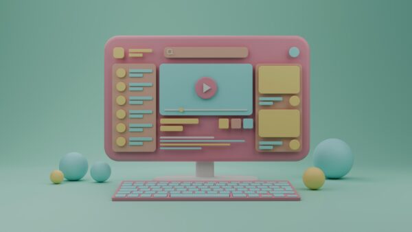

Website design trends change faster than most businesses can keep up. But chasing every new trend doesn’t always help. What really matters is choosing updates that make your site easier to use and more helpful to your visitors. Whether you’re looking for more leads, a better experience, or a stronger online presence, the right design choices set the tone.
It’s about more than how your site looks. The smartest design trends today focus on speed, clarity, and connection. From how your jingle demos play to how fast pages load, the details shape the user’s impression of your brand. Here are the website design trends worth paying attention to if business growth is your goal.
Emphasis On Mobile-First Design
Most people are browsing from their phones these days. If your site doesn’t work well on mobile, you’re risking first impressions. A mobile-first approach means designing for phone screens first, then scaling up for bigger screens like tablets or desktops. This way, the important stuff stays front and center and works better across the board.
Here’s what a mobile-friendly design usually includes:
- Large, easy-to-tap buttons
- Images that resize automatically
- Clean layouts with less text and more visual flow
- Quick load times to avoid users bouncing off
- Navigation that feels natural on thumbs
Instead of shrinking a desktop site to fit a phone, mobile-first starts with the phone and builds up. Think about how someone on a small device will use your site—what they’ll look for first, what they’ll click, and how fast they want that content. Designing this way keeps things simple and fast, which keeps people around longer.
Let’s say you offer jingle production services. If a client wants to check your demo tracks, they won’t wait if the player loads slow or the button doesn’t respond on mobile. But if they can instantly tap and hear a short clip, that quick win builds trust. A smooth mobile experience supports every part of your offering, from discovery to conversion.
Minimalist Aesthetic
Too much clutter on your website can confuse visitors. If everything is fighting for attention, nothing stands out. Minimalism helps guide people through your content without distraction. Clean, focused design builds credibility and makes it clear what action you want them to take.
Here are key traits of a minimalist website that work:
- A simple palette of one to three main colors
- Ample white space to make elements easy on the eyes
- Straightforward section headers that tell users what each area is about
- One clear call-to-action per page
Minimalist design isn’t plain—it’s clear. It leads your visitors without overwhelming them. For example, a service page that features one focused audio clip, a short description, and a play button will likely get more plays than a long explanation and too many samples at once.
A strong minimalist design can help highlight what makes your brand different too. With fewer elements on the screen, your voice, your jingle, or your radio spot becomes the center of attention. That helps your work speak louder than flashy widgets or overloaded menus ever could.
Interactive And Dynamic Elements
Your website should feel alive, not like a printed brochure. Interactive design grabs attention and makes users want to stay longer. When done right, small dynamic touches can show people where to go next or make their visit more enjoyable.
Here are a few examples of how to use interactive elements the right way:
- Add hover animations that indicate clickable icons or links
- Use micro-interactions, like a visual cue when someone is near a sound clip
- Animate sections as people scroll to guide them down the page
These small shifts help users stay engaged without overwhelming them. Say you offer a collection of radio ad samples. Instead of listing all of them with long blocks of text, you can have colorful audio cards that expand when clicked to play a sample and reveal details. This taps into curiosity and gives users control over what they hear.
What’s important is not to overdo it. Too many animations or popups can make a site feel busy or distracting. Keep your interactive features focused and purposeful, especially around your core offerings like audio demos or contact options.
Integrating Multimedia That Connects With Visitors
Text can only go so far. When your brand is built on sound, like jingles, voiceovers, and audio branding, your website should reflect that. Multimedia brings your service to life and lets potential clients hear and see what you offer. But it’s not just about uploading media—it’s about using it smartly.
Good multimedia adds value when:
- Audio and video files are compressed for fast loading
- Players are simple to use with easy-to-spot play buttons
- Short captions explain what each piece of media is for
- Your best work is placed at the top of the page, not hidden somewhere below
Take your main service page, for example. A simple section with a bold title, a 15-second jingle sample, and a one-line description like “Custom intro for local retail store” will get more attention than a long paragraph buried halfway down the page.
Smooth multimedia integration turns interest into action. If someone is impressed by what they hear right away, they’re more likely to explore more or reach out. Make it easy for them to feel the quality of your work from the very first click.
Personalization And AI Tools Tailored For Experience
It’s a lot easier to connect with someone when your site reflects their needs. Personalization helps make that possible. Instead of every visitor seeing the same thing, you can guide them to content or features that make sense for what they’re looking for.
Simple personalization and smart AI tools can improve flow without being annoying. For example:
- If someone browses health-focused jingles, show them more samples in that style later
- Let returning users jump right back to the quote form or content they viewed before
- Use a chatbot to give basic help, like explaining service offerings or how to request a sample
The goal isn’t to learn every detail about the visitor. It’s to make repeat visits smoother, reduce steps, and build familiarity. A first-time visit could be about education, while the second visit could be focused on hearing samples or getting in touch faster.
Personalized design helps remove friction without adding complexity. Done right, it feels like your website knows what the visitor wants without being pushy or trying too hard.
Future-Proofing Your Website Design
A website that grows your business is never finished. Design trends evolve. Visitor expectations shift. What worked last year might not be enough a few months from now. Regular updates help your site keep pace and continue working as a real business tool.
The most useful trends are the ones that create long-term wins—faster access, simpler layouts, powerful media, clean interactivity, and smart use of personalization. Those are the updates that stay relevant even when smaller style fads fade away.
Thinking ahead doesn’t mean total redesigns all the time. It just means staying open to change and checking in with how your site performs. Watch how your audience uses the site and notice where they drop off or get stuck. That’s where improvement matters most.
The right changes can keep your site useful, memorable, and enjoyable to use. Whether you’re showcasing audio work, scheduling projects, or helping potential clients get familiar with your services, the way your website supports that interaction can make a big difference.
Ready to transform your website with dynamic elements that captivate and retain your audience? Let Killerspots Agency enhance your site’s design with cutting-edge trends that focus on usability and engagement. Explore creative opportunities, like our green screen studio rental in Cincinnati, to enrich your visual storytelling. Contact us today to elevate your online presence and drive business growth.